A client called me last year, frustrated. His team had spent eight months and a significant budget building a stock management system. It worked perfectly — accurate data, real-time updates, full reporting. His staff refused to use it. They kept pen-and-paper records on the side because the system was "too complicated." Six months later, the system was gathering digital dust.
The software was technically correct. Nobody loved using it.
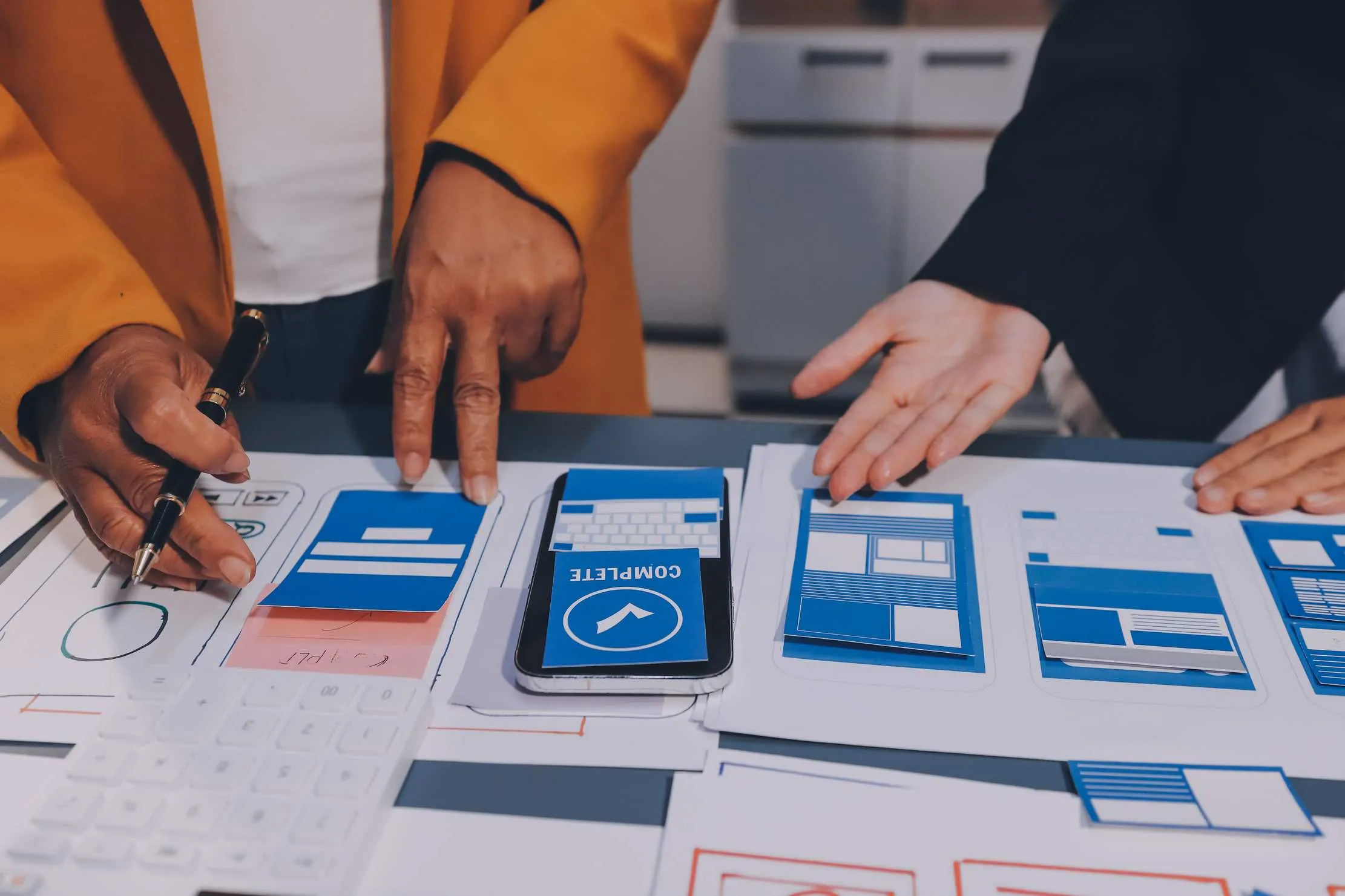
This is the gap between building a system that works and building a system people want to use. You don't close it with more features. You close it with deliberate attention to how people think, how they move through an interface, and how the whole experience makes them feel.
Here is what I have learnt from building web and mobile applications across retail, healthcare, logistics, and hospitality — about what separates the tools people love from the ones they endure.
The First Ten Seconds Decide Everything
A user forms a strong first impression within ten seconds of opening your app. This is not an estimate — it is measurable. Research from usability expert Steve Krug shows that users make snap judgements about whether an app is worth their time before they have read a single sentence.
Your opening screen has one job: show the user what they can do, not what the system is.
Bad opening screens say: "StockMaster Pro 4.2 is ready. Please read the documentation before proceeding."
Good opening screens say: "Good morning, Sarah. You have 3 low-stock alerts and 2 pending deliveries."
The difference is orientation. The good screen tells Sarah what is happening in her world, right now. It respects her time and assumes she came here to get something done.
What this means practically:
- Lead with the user's most common task, not a generic dashboard
- Show live data immediately — don't make users click to "load"
- Avoid splash screens, mandatory tutorials, or login walls before value is shown
- Use the user's name and context wherever you have it
Clarity Beats Cleverness Every Time
Most interfaces that frustrate users share a common trait: the designer was proud of a clever idea the user never asked for.
Animated navigation drawers that swipe from unexpected directions. Icons without labels. Menus nested three levels deep because someone wanted a "clean" look. These feel smart in a design review. In daily use, they exhaust people.
I had a client in the restaurant industry who wanted a POS terminal with a minimal interface — just icons, no text, to keep it "modern and clean." We built it. Trained the staff. Within two weeks, they had printed paper labels and taped them underneath every icon on the screen.
Labels were added in the next update.
Clarity means a user should be able to look at any screen and answer three questions in under five seconds:
- Where am I?
- What can I do here?
- What happened after my last action?
If any of those answers require hunting, guessing, or reading documentation, you have a clarity problem.
Quick clarity tests to run on any app:
- Cover the logo and navigation — can a new user still tell what section they are in?
- Show the app to someone who has never used it — what is the first thing they try to click?
- After a form submission, is it obvious whether the action succeeded or failed?
Respect the Mental Models Your Users Already Have
People come to your app with years of experience using other apps. They have learnt that the back arrow goes back. That a trash can icon deletes. That a search bar at the top searches the current page.
When you break these conventions — even for a "better" design reason — users experience cognitive friction. That pause is where frustration begins.
One of Jakob Nielsen's core usability heuristics is to match the system to the real world: use the language and concepts the user already knows. On a web app for a pharmacy, call the section "Dispensing" — not "Transaction Fulfilment Module." On a mobile app for a school, call the parent's view "My Children" — not "Student Dependant Dashboard."
Words matter. Structure matters. Icons matter. Deviations from convention must earn their place — they need to be significantly better, not just different.
Mobile UX Is Not Smaller Desktop UX
Many apps are designed on a desktop computer and then "made responsive" for mobile. You can see it immediately: tiny buttons, dense text, navigation that requires mouse-level precision to tap.
Mobile users are different in ways that change your design decisions:
They are often in motion. A desktop user sits with full concentration. A mobile user may be standing in a warehouse, holding a product in one hand, tapping your app with a thumb.
Their sessions are shorter. Desktop users sit down to complete tasks. Mobile users check in briefly, take an action, and leave. Design for five-minute interactions, not extended work sessions.
They make mistakes more often. Fat-finger errors are real. The minimum recommended tap target size is 44×44 points — roughly 7mm square. Smaller than that and users spend as much time correcting accidental taps as completing tasks.
Their context changes. Outdoor sunlight, indoor darkness, loud environments, one-handed use — mobile design must survive conditions that desktop design never faces.
The answer is not to enlarge everything. It is to redesign the mobile experience from scratch, asking what a mobile user most needs to accomplish — not porting the desktop interface to a smaller screen.
Feedback Loops: Tell the User What Just Happened
Every action a user takes needs a response. Not eventually. Immediately.
The human brain interprets silence after an action as failure. If a user taps "Save" and nothing changes for more than 300 milliseconds, they will tap it again. And again. Then they will tell their colleagues the app "always double-saves."
Feedback comes in three layers:
Immediate feedback (0–100ms): The button changes state the moment it is tapped — it darkens, animates, shows a spinner. This tells the user: your tap registered.
Process feedback (100ms–a few seconds): A progress bar, a spinning indicator, a "Saving…" label. This tells the user: something is happening.
Result feedback (on completion): A green tick, a success message, a notification update. This tells the user: it worked, here is the outcome.
Miss any layer and users feel uncertain. Uncertain users repeat actions, call support, or lose confidence in the system entirely.
Micro-interactions — those small animations and state changes — are not decoration. They are communication. A well-placed animation that confirms an item was added to a cart tells a story in 200 milliseconds that would take a sentence to write.

Speed Is a Feature, Not a Bonus
Slow apps feel broken. This sounds obvious but is regularly underestimated in development priorities.
Google found that 53% of mobile users abandon a page that takes longer than three seconds to load. That is more than half your potential users gone before they have seen your interface.
But perceived speed matters as much as actual speed. An app that loads in one second but shows nothing until complete feels slower than one that takes two seconds but starts showing content immediately.
Design patterns that improve perceived speed:
- Skeleton screens: Show the shape of content before data loads. Users see something is coming, rather than staring at a blank screen.
- Optimistic UI: Act as if the server will succeed before it confirms. Mark a task done immediately — roll back with an explanation only if the server fails.
- Progressive loading: Show important content first. Product names and prices appear instantly; images load after.
- Cached data: Show yesterday's data instantly while today's data loads in the background. A user who sees slightly stale figures is far less frustrated than one staring at a spinner.
Put Real Users in Front of Your App Early
The most effective thing you can do for your app's usability is watch five real users try to use it before you think it is finished.
Not polished. Not perfect. Just functional enough to test.
Jakob Nielsen's research shows that five users uncover approximately 85% of usability problems. You don't need a large study. You need five people who match your target audience, a set of realistic tasks, and the discipline to watch without guiding.
What you see is often uncomfortable. Users click the wrong button repeatedly. They misread a carefully worded label. They look for a feature you were certain was obvious and don't find it.
Every one of those moments is a gift. It is cheaper to fix a design problem in testing than after launch.
The key rule: during a usability test, you must not help. When a user is stuck, let them be stuck. What they do when stuck — whether they hunt for help, try random options, or give up — tells you more than what they do when everything goes right.
Accessibility Is Good Design, Not Extra Work
Accessibility is often treated as a checkbox added at the end of a project. This leads to patched-in solutions that help no one and annoy everyone.
The better frame: accessible design is well-considered design. When you ensure adequate colour contrast, you help the 8% of men with colour blindness — and everyone using your app in bright sunlight. When you support keyboard navigation, you help users with motor impairments — and power users who prefer shortcuts. When you write meaningful button labels, you help screen reader users — and everyone who skims.
At minimum, every app should meet these standards:
- Colour contrast ratio of at least 4.5:1 for normal text
- All interactive elements reachable by keyboard
- No information conveyed by colour alone
- All images have descriptive alt text
- Form fields have visible, persistent labels — not placeholder text that disappears on focus
These are not burdens. They are signs of a team that thought carefully about the full range of people who will use their product.

Design the Error States, Not Just the Happy Path
Most design work happens on the happy path — the sequence of screens when everything goes right. Create account. Log in. Complete task. Log out.
The problem is that users regularly don't follow the happy path. They mistype passwords. They submit incomplete forms. They lose internet connection mid-upload. They try to access a page they are not permitted to see.
Error states need as much design attention as success states. "Error: 403" or "An unexpected error occurred" breaks user confidence immediately. A well-designed error message explains what went wrong and what the user should do next.
Good error messages:
- Say what went wrong in plain language: "Your session has expired — please log in again."
- Tell the user what to do next: "Check your internet connection and try again."
- Preserve any work done where possible: "Your draft has been saved."
- Never blame the user: "Something went wrong on our end."
Empty states are also frequently neglected. A blank table with no explanation tells a new user nothing. An empty state that says "You have no orders yet — add your first product to get started" tells them exactly where to begin.
The App People Love Is the One That Gets Out of the Way
Every principle in this article points to the same underlying idea: the best interfaces are invisible. The user is not thinking about buttons and menus. They are thinking about the task they came to complete.
Great UX is achieved when the system disappears — when ordering stock, processing a sale, or filling in a patient record feels as natural as writing on paper.
Getting there requires discipline. It requires saying no to extra features that add complexity. It requires testing with real users rather than trusting your own familiarity with the system. It requires caring about the three-second load time, the error message nobody reads carefully, and the button that is 2mm too small.
These details compound. A system where every small decision was made thoughtfully feels entirely different from one where they were left to chance. The client I opened with — the one whose staff kept paper records alongside the system — eventually rebuilt it. Same data. Same logic. This time, with the people who would use it in the room from day one. The paper went away.
If you are building a web or mobile application and want to get the UX right from the start — not retrofit it after launch — that is the kind of work we do. Get in touch and let us talk through what your users need. You can also explore our software development services or see what we have built on our portfolio page.
Peter Bamuhigire
Technology and Business Consultant with over 15 years of experience across more than 10 African countries. Founder of Chwezi Digital Solutions, based in Kampala, Uganda.
Discuss Your App Project